Posted on November 10th, 2008 at 10:20 pm by dr.hoo
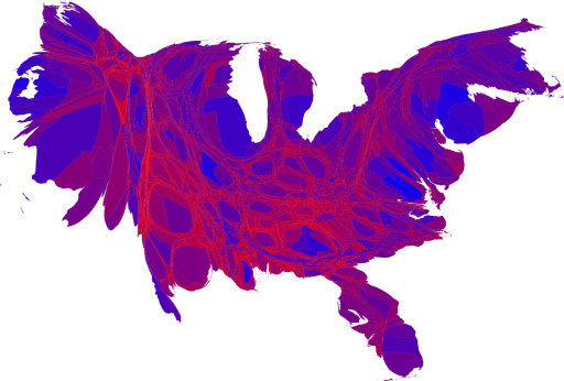
Mark Newman at the Department of Physics and Center for the Study of Complex Systems, University of Michigan generated this awesome collection of election maps. My favorite is above.
H/T Andrew Sullivan
UPDATE:
As Steve and Josh commented, the red/blue colors can give a biased visual perspective. Here’s the same map with the hue rotated 120 degrees.
