If It's Unpredictable, It's Informative: -∑p(x)log[p(x)]
Tracking Michael Posted on October 1st, 2010 at 3:04 am by dr.hoo
Sifting through a bunch of data viz projects for a project I’m working on. Came across this one that is like no other I’ve seen yet.
On May 4th, 2007, we asked internet users to help isolate Michael Jackson’s white glove in all 10,060 frames of his nationally televised landmark performance of Billy Jean. 72 hours later 125,000 gloves had been located. wgt_data_v1.txt (listed below) is the culmination of data collected. It is released here for all to download and use as an input into any digital system. Just as the data was gathered collectively it is our hope that it will be visualized collectively. Please email links to your apps, video, source code, and/or screen shots to evan[at]eyebeam[dot]org. Work will be exhibited in an online gallery and depending on popularity and interest potentially in a forthcoming physical gallery exhibition as well. Huge thanks to everyone that contributed to the data collection.
Be sure and watch the video to see some of the crazy and not so crazy uses for all that tracking data.
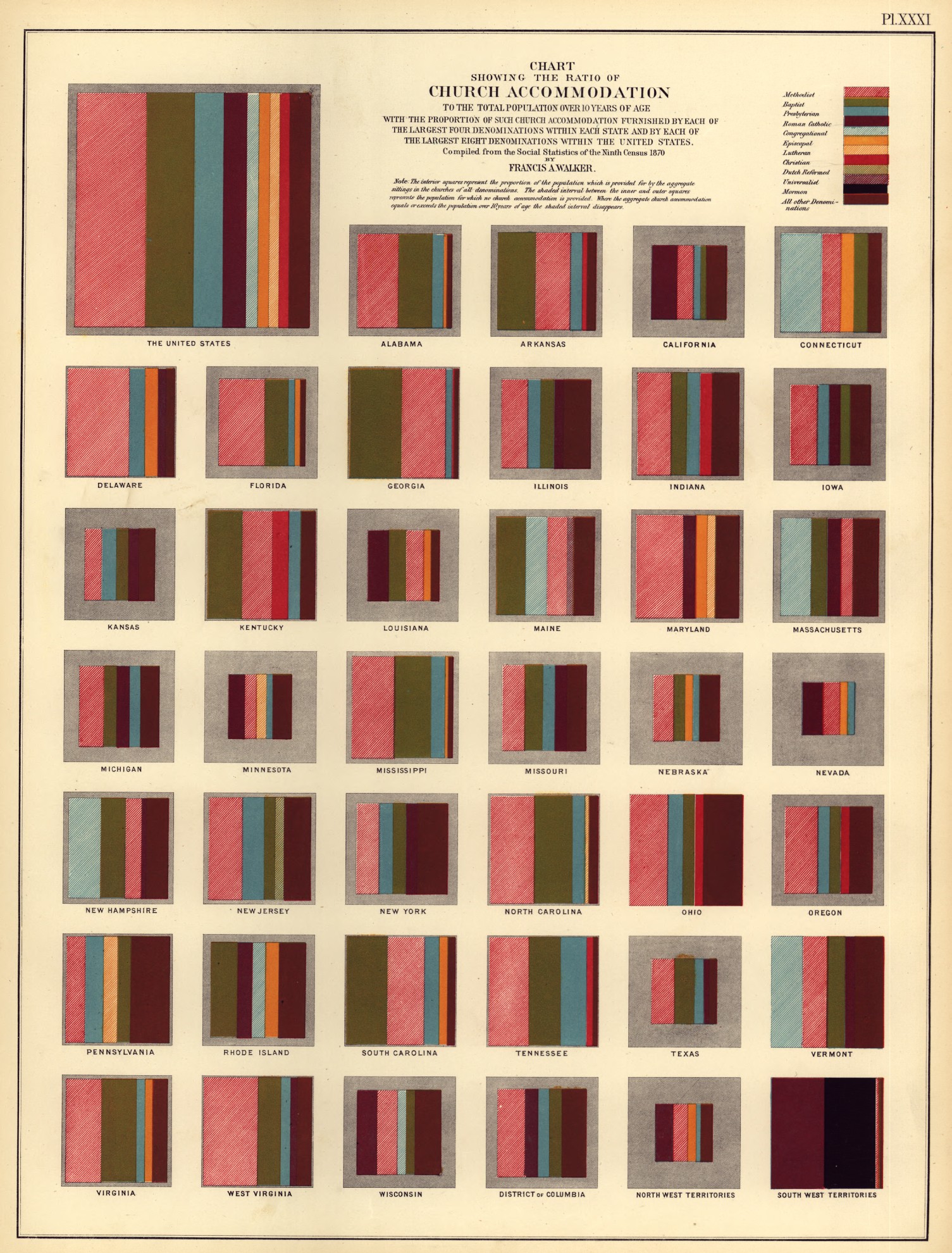
You wouldn’t expect to find such beauty in the Statistical Atlas of the United States, Based on the Ninth Census (1870) from the Library of Congress, would you? Sophisticated data visualizations, hand-calculated and hand-engraved, in beautiful colors, prepared by a staff headed by Francis A. Walker, M. A., superintedent of the ninth census.
The display above shows you, for each U. S. state and territory, the proportion of the church-going population (the colored boxes) relative to the total population (the shaded box in which the colored boxes are set), as well as the breakdown by the top 11 denominations!
An amazing/creepy visualization of what life might be like when we are “jacked in” to a virtual overlay 24/7. Lots of great little details in the animation. Note the sea of advertising that can be controlled, paying you more money per second depending on your environmental saturation.
The latter half of the 20th century saw the built environment merged with media space, and architecture taking on new roles related to branding, image and consumerism. Augmented reality may recontextualise the functions of consumerism and architecture, and change in the way in which we operate within it.
A film produced for my final year Masters in Architecture, part of a larger project about the social and architectural consequences of new media and augmented reality.
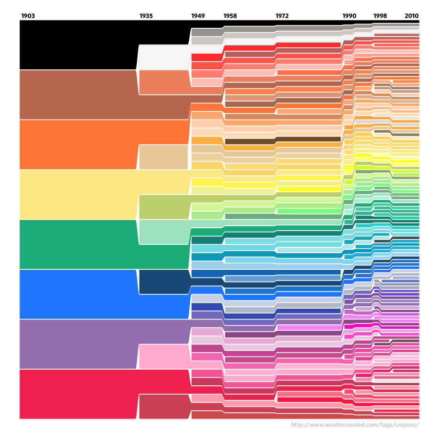
Crayola’s Law Posted on January 19th, 2010 at 8:57 pm by Steve
The chart above is a lovely info-graphic showing the introduction of colors into the Crayola crayon box over time. The creator of the chart derived from the data Crayola’s Law: the number of crayon colors doubles every 28 years.
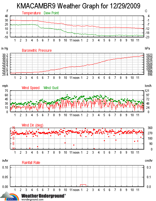
Damn It’s Cold! Posted on December 30th, 2009 at 2:37 pm by Steve
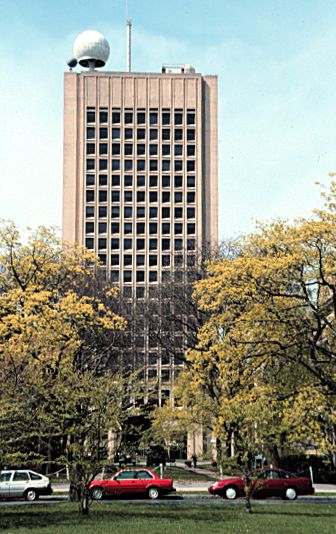
The image above is the daily trace of data from the weather station atop the Green Building at MIT (pictured below). The top box shows you the temperature, which dropped from 32°F to 10°F in 24 hours… the second box shows the steadily rising barometric pressure… the third box shows the wind speeds with gusts above 60 MPH and sustained wind speeds well above 40 MPH – the Green Building is about 300 feet tall, so it’s well above any obstructions and hence records higher wind speeds than ground stations.