Posted on November 17th, 2011 at 4:39 pm by Steve

Nuke New England!
Posted on April 18th, 2011 at 3:03 pm by Steve
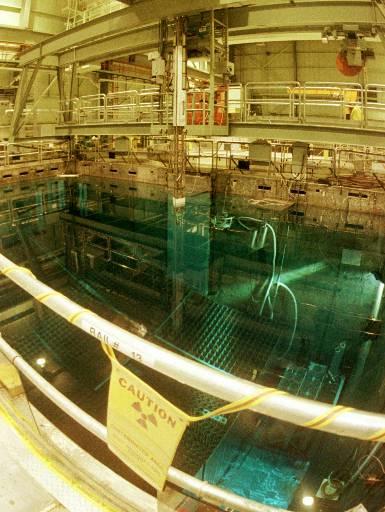
The spent fuel pool at Vermont Yankee
Posted on April 18th, 2011 at 3:03 pm by Steve
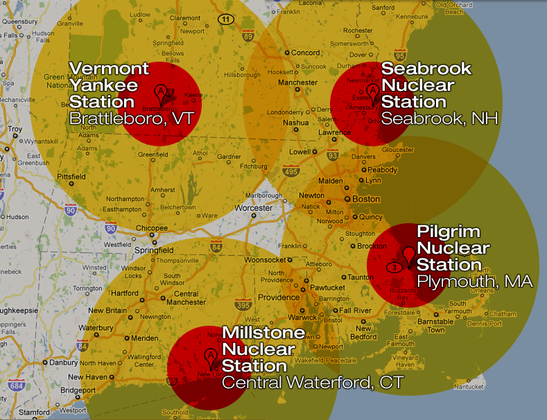
Imagine a “station blackout” occurs at the Pilgrim Nuclear Generation Station in Plymouth, MA. Within days, a hydrogen explosion shatters the secondary containment building, possibly breaching primary containment as well. The government orders a mandatory evacuation for areas within 20 km of the plant, but the BBC World Service is saying that the British government has advised their citizens not to travel within 50 miles of Plymouth.
This catastrophe at Plymouth (or Seabrook, or Vermont Yankee, or Millstone in Connecticut) hasn’t happened…yet. But the notion that “it can’t happen here” has taken quite a beating over the last month. If and when a disaster like this strikes, we’ll have hours to evacuate. Think for a moment what it would take to evacuate just the inner “exclusion zone” around one of these reactors. Where are we going to put all the people from Brockton, Plymouth, Taunton, Fall River, Buzzards Bay, Sandwich…? And what about the more than a million people that live within 50 miles? Remember that, even now, the US government is advising Americans not to travel within 50 miles of Fukushima, a month after the crisis began. How can we avoid travel to the entire Boston metro area?
Of course, Pilgrim only has one reactor, where Fukushima Daiichi has six. On the other hand, Pilgrim has more than TWO MILLION POUNDS of radioactive spent fuel assemblies stored on site. A loss of coolant water in the tightly-packed spent fuel pool at Plymouth – which has far less containment, and far more fuel, than the reactor core – could quickly lead to a fire and a massive excursion of radioactive isotopes of cesium, strontium, iodine, and others. An explosion could spread deadly plutonium and uranium particles for miles (as happened at Fukushima). In other words, even with fewer reactors, a station blackout at Plymouth could have worse radiological consequences than the ongoing disaster in Japan.
The spent fuel pool at Vermont Yankee
The reactor at Plymouth is a General Electric Mark I Boiling Water Reactor, the same design and vintage of the “troubled” reactors in Japan. Of course, America’s Nuclear Industry and Regulators (is there a difference?) are quick to point out that American reactors have strict safety standards and have been upgraded and so on. Ask them about the spent fuel pools. Ask them how long they can run the pumps to maintain sufficient cooling in the event of a station blackout (whatever the cause). Ask them the consequences of allowing the operator to store 2,918 spent fuel assemblies in a pool that was designed and originally licensed to hold just 880 assemblies.
Of course, the spokesman for Vermont Yankee is quick to assure us, “We believe pools are perfectly safe. It was designed to be safe and there are redundant systems so there is never a loss of coolant.” Indeed. For some reason, those fools in Japan neglected to design their pools to be safe, and that’s why they suffered a complete loss of coolant and melting of the fuel rods in the spent fuel pool. Silly Japanese!
Who Watches the (Weather) Watchmen?
Posted on April 13th, 2011 at 5:51 pm by Steve
Posted on April 13th, 2011 at 5:51 pm by Steve
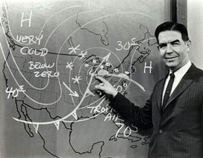
I’ve long wanted to keep records of weather forecasts and compare them to actual results. But, I’m too lazy.
Fortunately, Forecast Advisor has started to do that for us! And, it turns out that my suspicions were correct.
At least for Boston, the weather forecasts are less than 80% accurate. Now, consider that these data are looking at just the 1-3 days ahead forecasts, and in fact are collapsing the data. The day-ahead forecasts are usually more accurate than the 3-days ahead forecasts. The company sells a data feed that I’m sure drills down to this level and beyond.
But consider: for March 2011, the National Weather Service predicted the high temperature within 3° F of the actual high temperature only 40% of the time! They accurately predicted the low temperature +/- 3° 53% of the time in March. They did slightly better with their precipitation forecasts – if they called for rain or snow, they were right about 83% of the time.
Over the past year, they did better on temperature predictions (63% right on the highs, 70% right on the lows) but worse on the precipitation calls (75% accurate).
What can we conclude? National Weather Service forecasts are better than chance… but not by a lot. Turns out, you don’t need a Weatherman to know which way the wind blows…

I can haz freedum?
Posted on February 4th, 2011 at 10:48 am by josh-wah
Posted on February 4th, 2011 at 10:48 am by josh-wah
The Cute Cat Theory of Digital Activism – Ethan Zuckerman
Blocking banal content on the internet is a self-defeating proposition. It teaches people how to become dissidents – they learn to find and use anonymous proxies, which happens to be a key first step in learning how to blog anonymously. Every time you force a government to block a web 2.0 site – cutting off people’s access to cute cats – you spend political capital.
Read the whole thing – it’s great.
Gratuitous lolcat inclusion:

Tracking Michael
Posted on October 1st, 2010 at 3:04 am by dr.hoo
Posted on October 1st, 2010 at 3:04 am by dr.hoo

Sifting through a bunch of data viz projects for a project I’m working on. Came across this one that is like no other I’ve seen yet.
On May 4th, 2007, we asked internet users to help isolate Michael Jackson’s white glove in all 10,060 frames of his nationally televised landmark performance of Billy Jean. 72 hours later 125,000 gloves had been located. wgt_data_v1.txt (listed below) is the culmination of data collected. It is released here for all to download and use as an input into any digital system. Just as the data was gathered collectively it is our hope that it will be visualized collectively. Please email links to your apps, video, source code, and/or screen shots to evan[at]eyebeam[dot]org. Work will be exhibited in an online gallery and depending on popularity and interest potentially in a forthcoming physical gallery exhibition as well. Huge thanks to everyone that contributed to the data collection.
Be sure and watch the video to see some of the crazy and not so crazy uses for all that tracking data.
Knobs and Dials – Yummy!!!!
Posted on September 6th, 2010 at 1:43 pm by dr.hoo
Posted on September 6th, 2010 at 1:43 pm by dr.hoo
You know how dun like dem knobs and dials. Dark Roasted Blend has an awesome collection of the,
Including this virtual cockpit of the Space Shuttle:

Beautiful Info-Graphics From 1870
Posted on June 4th, 2010 at 7:37 pm by Steve
Posted on June 4th, 2010 at 7:37 pm by Steve

You wouldn’t expect to find such beauty in the Statistical Atlas of the United States, Based on the Ninth Census (1870) from the Library of Congress, would you? Sophisticated data visualizations, hand-calculated and hand-engraved, in beautiful colors, prepared by a staff headed by Francis A. Walker, M. A., superintedent of the ninth census.
The display above shows you, for each U. S. state and territory, the proportion of the church-going population (the colored boxes) relative to the total population (the shaded box in which the colored boxes are set), as well as the breakdown by the top 11 denominations!
I highly recommend that you check out all the charts and maps!